

By- Christopher Vargas and Vishal Muthia 8A


This
beautiful picture is of a character in a popular manga called Bleach created by
Tite Kubo. I chose this picture because of its shading and attention to detail.
The 3d effect works very well too. This picture will be extremely familiar to
any fans of this anime and manga. The teeth on Ichigo (the character) are
brought into life with the great shading. Overall a very well drawn picture of
Ichigo Kurusaki.
By A Larbi 8A
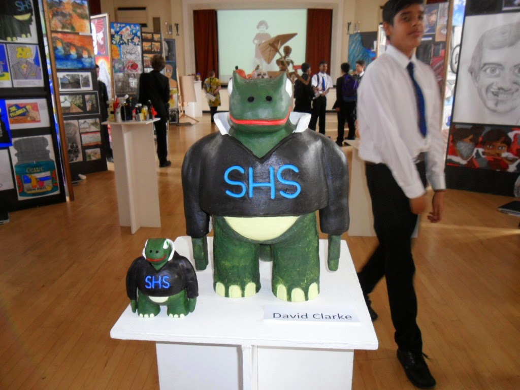
The piece we have chosen is the dragon by David Clarke. This
piece was inspired by Southborough High School as it is wearing a school blazer
and has a collar. I like this piece as the artist has emphasised the scales by
adding a different colour to make them stand out. It uses a range of colours
that work well together and uses different shades of green to show it.
This dragon is at the front of the gallery and looks like it represents the School
and welcomes visitors the gallery. It would be even better if the artist gave
it more red to stand out and if the the hands were made less flat. The thing that drew us
to this piece of art was the fact that he used so many colour that work well
together and help to represent the dragon. It looks like it was styled on a
frog and inspired by a dragon.
By Greg and Robert 8A
No comments:
Post a Comment